A Better, Beautiful and Big Board of Data
Do you have a big screen that proudly displays the work your team has done; a place to see how visitors are flowing in and out of your stories in real time?
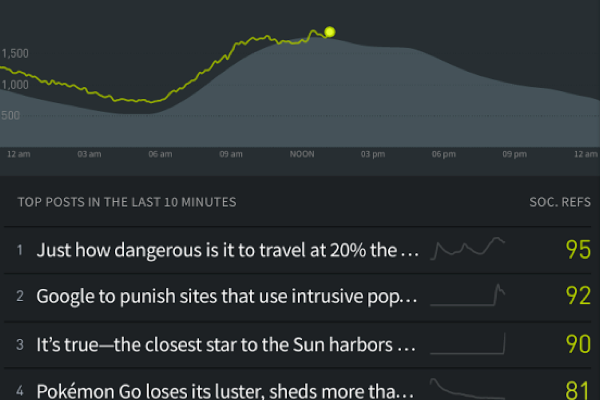
Parse.ly’s real-time screens have always been a favorite of our users, and the latest updates to our Overview Screen make it impossible not to use that second monitor or TV screen to display your audience analytics.
Configure Your Overview Screen
The last release allowed you to choose your metrics in the overview screen. Now, you can do a lot more including:
- See up to three lists
- Pick from posts, authors, sections or tags
- You can choose your metrics and time frame for each list
With upwards of 1,440 possibilities for your overview screen, make sure you try out at least a few of them. Once you’ve found your settings, bookmark it for future use – or share it with another Parse.ly user by copying the URL.
We love to look at our summary stats in the office to see how today is going overall, or see how yesterday shaped up. Choose from different metrics and time options to understand the last 48 hours. You can also hide these so that you only focus on the lists you’ve picked. We’re still working on a summary of tomorrow’s data…
Not only do these updates allow you to do more data customization, this lets you use the overview screen on any device, from long tall vertical monitors, to tablets and televisions

Check out how you can configure your options in this video, or play around in your overview screen by moving your mouse and clicking the gear in the upper right-hand corner.
http://parsely.wistia.com/medias/tdwqfe9r3d?embedType=async&videoFoam=true&videoWidth=500
See lighting fast data summaries
Another new feature we think you might be excited about? (Editor’s Note: A personal favorite here!)
Any time you select a time frame in the historical views, a summary appears for your selected metric and filter. If you’re not doing exports or running reports, these summaries can be a quick way to do a comparison.
Get inspiration from our Page Guide
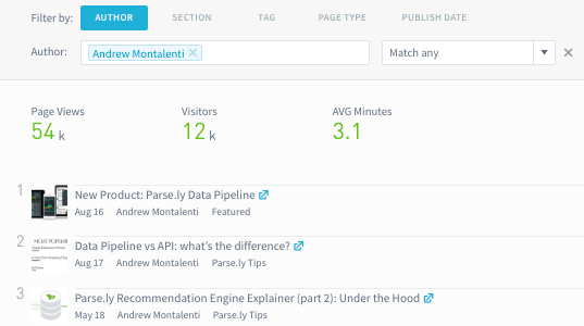
Our success team talks to hundreds of media companies, helping with strategy and explaining how to use the data in their Parse.ly account. Now, they’ve compiled their knowledge into a guide that can be used directly in the dashboard.
Wondering what to do on any screen? Click the Page Guide at the top to clarify what you’re looking at, get definitions on metrics and even find some new ideas for what to do with the data you’re looking at right now.

Check out past product changes in our Changelog series and sign up for blog updates to hear about the latest Parse.ly changes!