Introducing Comparisons: Easy Context for Content, Author, and Topic Performance
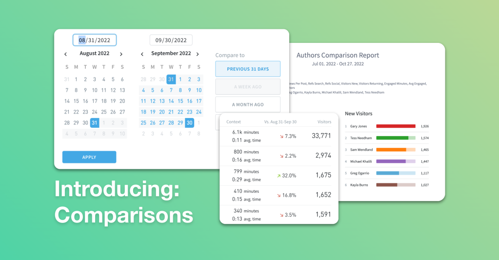
We’re excited to announce comparisons—comparison mode and author/section comparisons—in the Parse.ly dashboard. These features make it easy to see the “before and after” impact of your work and contextualize trends in your content performance.
Numbers without context are confusing at best and meaningless at worst.
- “The Lakers scored 113 points last night!” But what did the other team score?
- “She was going 45 miles per hour.” But what was the speed limit?
This is even more true when it comes to statistics on your content.
- “Our site has 3,000 users on it right now!” But is that more or less than this morning, yesterday, and last week?
- “Our politics section brought in 15,000 new visitors from Facebook last year!” But how was that affected by the algorithm change?
You need context to make smart data-driven decisions for your content strategy. And with so much data, so much content, and so many questions to answer, you need to locate and understand that context quickly and easily.
That’s why Parse.ly added comparisons to our content analytics dashboard. There’s no need to export or copy/paste data, or manually combine datasets into a spreadsheet. With comparisons, this is all visual and easy.
Let’s take a look at these new features and what you can do with them.
Comparison mode
Comparison mode makes it easy to see the “before and after” results of your work, comparing one time period of results against another—side by side, in a single view. It calculates the percent differential for you too, so you don’t have to pull out a calculator or try dividing 47,150 by 35,590 in your head.
Writers, editors, content marketers, and SEO analysts contextualize their content data with comparison mode to uncover spikes and dips in post, author, and topic performance.
Is a topic more interesting to my audience this month compared to last month?
Audience interest is dynamic. Hot topics come and go. Popular content formats erupt and dissipate. Remember when everyone was talking about ‘pivot to video’? Staying relevant is knowing when to lay off when something gets old and when to hop on before the buzz fizzles out. What worked last month could very well fall flat this month.
Use compare mode to keep a pulse on your team’s performance by topic and content type day over day, month over month, quarter over quarter, etc.
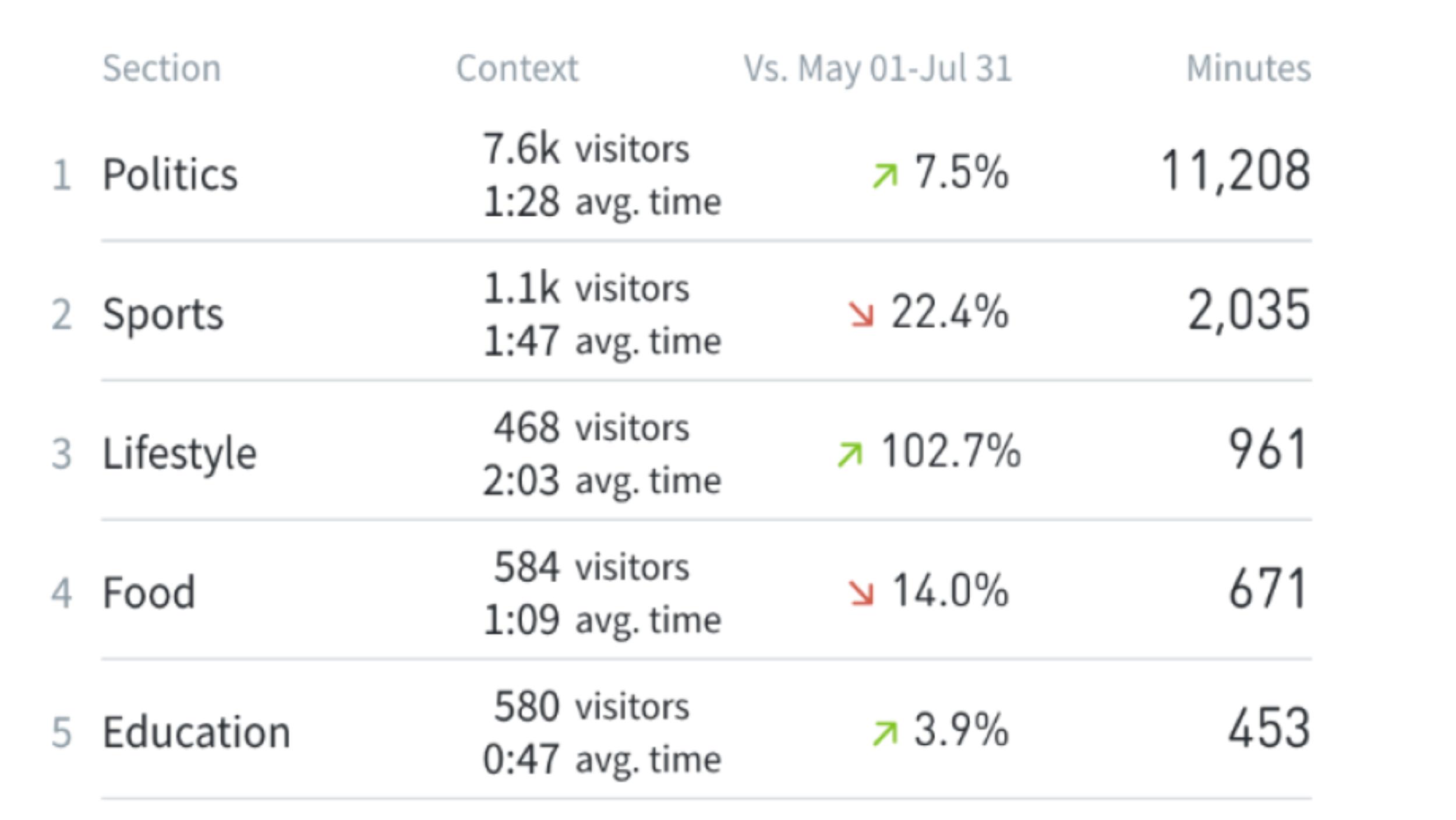
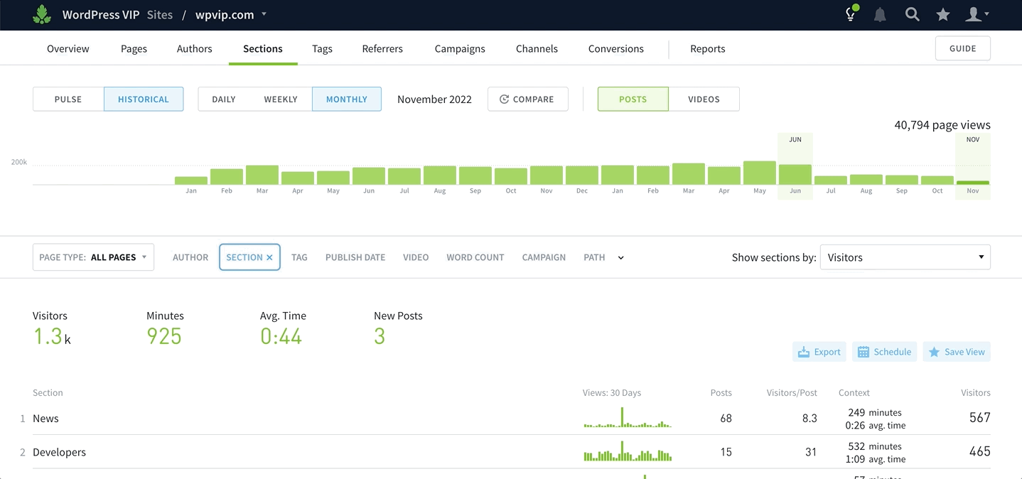
In the “Sections” tab of the Parse.ly dashboard looking at historical data:
- Highlight the timeframe of data you want to contextualize.
- Sort by the engagement metric you’re optimizing for (engaged time, recirculation rate, returning visitors).
- Click “COMPARE”.
- Choose to compare to the previous equivalent timeframe.
- Analyze the resulting green/red arrows and percentage differentials.
This workflow helps you spot dips and spikes in engagement to avoid over-producing for and over-indexing on exhausted topics. Use this visibility to allocate resources and effort appropriately.
How did my additional effort on distributing content perform this quarter versus last?
After you decide to put more effort behind a certain topic or type of content, use compare mode to see if the extra oomph is paying off.
If you’re testing out new channel tactics, putting more effort into distribution, or allocating more dollars to promotion, compare data from before and after you began testing to see how engagement, loyalty, and conversions are affected.
Say you targeted a new audience last month and want to see if they’re more valuable than your old audience. Compare data from this month to last month, choose the conversions metric to sort your data, and analyze the results—is the new audience quality traffic, or cheap clicks?
Did a post perform better after I made SEO changes to its metadata?
SEO is another volatile piece of the content puzzle. Results can be mysterious and confusing, especially if you’re getting help from an agency or contractor. Use compare mode to check if your optimization efforts are paying off and pleasing the search engine gods.
Say you enhanced the meta description for all your top-of-funnel posts last month. Compare this month to last month, sort by search referrals, and analyze the difference in traffic from search to see if your changes made a difference.
This is especially helpful if you need to verify the results that your SEO agency reports back to you. Maybe they reworked your top 20 articles or ungated a few high-converting pieces. Look at the before and after on that effort with compare mode to see if the money you paid them was well spent.
Author and Section comparisons
Author/section comparisons are the other half of Parse.ly’s comparison functionality. While compare mode contextualizes data from one time period to another, author/section comparisons contextualize data from one author or one section to another.
This feature makes it easy to see how the writers on your team and the sections on your website stack up against each other. You can look at these breakdowns through various KPI lenses.
Editorial and marketing managers use author comparisons to identify their writers’ strengths and weaknesses. And they use section comparisons to understand how each section on their site is contributing to overall goals.
Who should write for which stage in the funnel?
Every writer has their strong suit. Successful content teams embrace this and allocate their team members’ efforts accordingly. Some authors are great at writing content that subscribers want to read. Some are known for creating highly engaging pieces. And others have a knack for bringing in new readers from social or search.
Use the Comparisons tab to decide which authors are best suited to write for the top, middle, and bottom stages of the content strategy funnel.
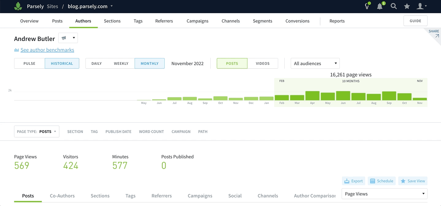
Looking in Parse.ly at historical data in the “Authors” tab, open the individual Author page for a writer you want to learn about and follow these steps:
- Highlight the timeframe of data you want to surface—depending on the amount of content your team is producing.
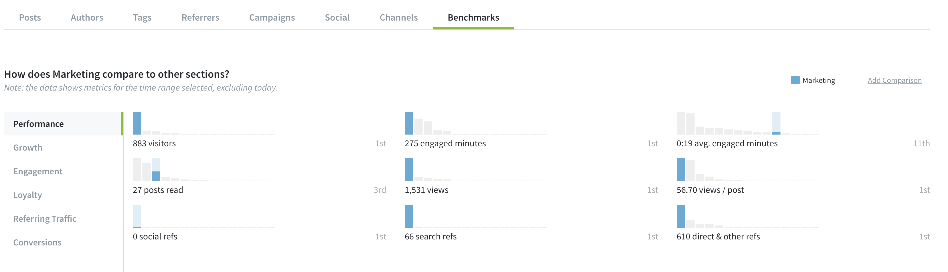
- Scroll down and select “Author Comparisons”.
- Toggle through the six tabs on the left side of your screen (Performance, Growth, Engagement, Loyalty, Referring Traffic, and Conversions).
- Identify which of these KPIs the author excels in compared to the rest of the team.
- Encourage them to create more content that contributes to those goals.
Use this workflow to compare your team members’ performance, uncover hidden strengths, and focus your content strategy.
Why are the authors with the most views not converting? How can we learn from each other?
Looking in author comparisons, you might find that the authors who get the most views aren’t the ones whose content converts. This isn’t necessarily a problem if you’re clear on who should be working towards which goals. But either way, there’s an opportunity to dig in and help your team members become more well-rounded contributors.
Sit down with the author who excels in traffic volume and the one who rakes in the conversions. Take a close look together at the content they’ve both produced and see what they can learn from each others’ strengths.
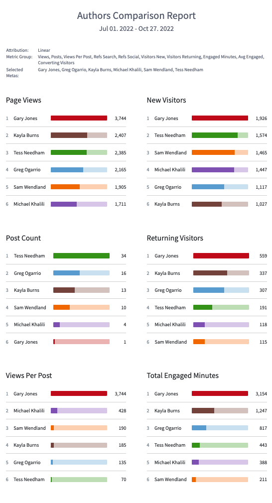
If you want to incentivize this type of skill sharing, use the Parse.ly comparison report to run a contest with your writers. This report allows you to compare sections or authors to each other, across a range of metrics. Now, you can see multiple metrics and multiple aspects in the same report.
Set up a weekly or monthly author comparison report that gets sent to your team automatically, and let them identify where they need to improve and ask for help from the appropriate colleagues.
Which goals should each section be working toward?
The sections on your website have nuanced strengths and weaknesses as well—in terms of which KPIs they contribute to. Some might be more engaging for new or returning visitors, while others could lead to higher conversion or recirculation.
Use section comparisons to get visibility into what this breakdown looks like for your site and address gaps in your website content strategy. Follow the same process for surfacing author comparisons, but this time start on a section page as opposed to an author page.
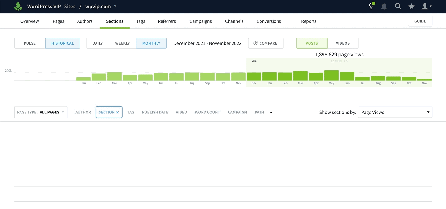
Figure out which sections and KPIs you’re over- or under-indexing on, and fill in the gaps accordingly. Ideally, your site should have sections that excel in each of the top-,middle-, and bottom-funnel KPIs.
If your case study section isn’t doing a good job of converting readers, for example, tap in a few more writers with the appropriate strengths to work on it. Or if your politics section is having no trouble attracting new visitors, see if you can take a few writers off that section and use them to bolster a struggling section.
When you end up reallocating writers to different sections, use compare mode after a month or two to see how that extra effort paid off.
More on Parse.ly comparisons
To Parse.ly customers: we hope you enjoy using these new comparison features and they’re as helpful for you as they are for us in tracking our own content performance. As always, feel free to reach out to our support team for guidance and feedback.
If you aren’t a Parse.ly customer and want to learn more about Comparisons, request a demo and we’ll show you around.