Ratio Metrics: How Atlantic Media Measures Article Performance
This is a guest post by Adam Felder, Associate Director of Digital Analytics at Atlantic Media.
Frequently in analytics, one has a tendency to only look at the stories that were wildly successful. This is a rather myopic view of success. Internally, we refer to the “80/20” rule: that the top 20 percent of our stories drive about 80 percent of our traffic. The actual ratios are closer to parity, but “80/20” makes for an easy-to-memorize catchphrase.
Very often, however, there are not terribly useful lessons to learn from the upper 20% of traffic—they catch the perfect storm of social sharing, meme riding, a breaking story within the larger news cycle, etc. The success of these stories is not due to any specific repeatable step or steps.
Large online publishers like TheAtlantic.com publish diverse content on a variety of topics at a high velocity. I began to wonder: could we use all this data to get a clearer picture of our content’s performance?
Consider the Entire Body of Work, Not Just the Successes
Looking at only this top 20% is understandable, though: it’s a natural tendency to emphasize the successes in any given month. Also, trying to consider every article a site produces in a single month is an unwieldy task. TheAtlantic.com, for example, produces several hundred articles per month, and many sites produce thousands. Even with a sophisticated tagging setup it’d be virtually impossible to manually track meaningful variables. Hence the tendency to punt on the misses and near-misses and look almost solely at the more manageable subset of “successful” content.
Problem is, that doesn’t tell the whole story about your site. Or even half the story. If you buy into the 80/20 rule, the “focus on success” approach ignores fully 80% of your content. That’s problematic for a couple of reasons: not only do you end up with less data and an incomplete picture of what makes your site tick, but you’re ignoring the majority of your own content—and that’s where your largest growth potential lies.
Moneyball for Digital Analytics
This is where Parse.ly comes into play. Due to its contextual tagging and its ability to quickly compile a data file of all published content within the analysis window, it’s the ideal tool for robust content analysis.
We’re not reinventing the wheel with this approach; it’s really just cribbing ideas from baseball scorekeeping. Perhaps ironically in the era of big data and sabermetrics vs. traditional baseball analysis, the metrics we borrow for digital analytics are some of the most basic and longest-tenured.
Ratio metrics can be applied to any unit of analysis: authors, site sections, topics, combinations of topics, referrers, etc. We use the following 4 metrics in our analysis:
- Batting Average
- Slugging Percentage
- Average Plus Slugging
- Isolated Power
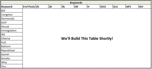
We’ll walk through each of these momentarily. For the sake of this demonstration, we’ll use headline keywords from another Atlantic Media site, NationalJournal.com, and build the table step-by-step.
Building Your Ratio Metrics, Step-by-Step
Step 1: Download Your Data
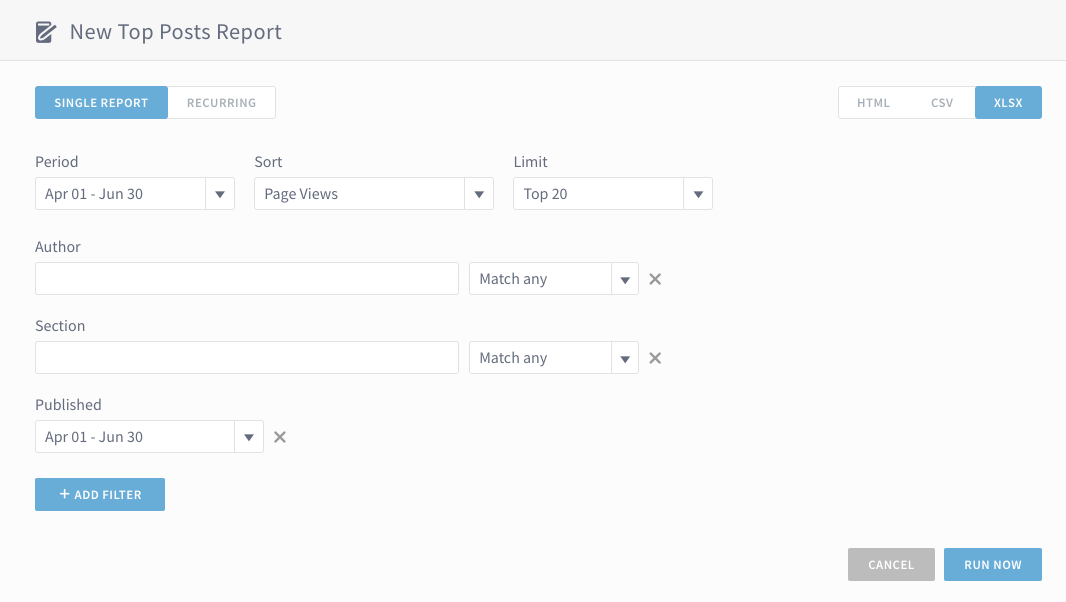
Obviously, you can’t do anything without a data set. Thus, we’ll use the “Reports” tool in Parse.ly’s analytics dashboard to collect our data. In this example, we’re using all content published between April 1 and June 30, 2013.
Step 2: Determine Your Success Thresholds
In baseball, there are four different types of hits: singles, doubles, triples, and home runs. All of them are “good” in the sense that the batter reaches base safely and does not make an out, but some are objectively better than others: the more bases a hit is worth, the more valuable it is.
The same holds true for analytics. Your site likely doesn’t have “stories that succeed” and “stories that don’t,” but rather several gradients of success to go with the unsuccessful bunch. Thus, we need to determine what these gradients are, and where to draw the line. In truth, there’s no reason why analytics needs to stick with just four success gradients; it’s merely a convenient parallel to baseball. If you feel your site has three distinct gradients of success, or five, that’s fine as well.
In any event, there are two ways you can set your thresholds: norm-referenced or criteria-referenced.
Norm-Referenced looks at all your published content and ranks each piece against its brethren. In this analysis, for example, we might say that a “successful” post is anything that gets more than the median number of page views, though clearing the median is only a single. Getting past 75% of all content may be a double, and the home run may be those pieces that outstrip all but a select few pieces of content.
The advantage to this approach is that it allows for site growth. If a site doubles in audience (and that doubling is distributed anywhere close to normally) in a given month, the norm-referenced criteria grow along with it.
Further, because you’re only referencing against your own content and the metrics calculated are ratios rather than raw numbers, it’s easy to share your data with others—even competitors, in theory. The tables we’re using in this blog post are with live data, but there’s no way to reverse engineer them and see raw traffic numbers. It would presumably be mutually beneficial for analysts to compare notes on keywords and see what kinds of stories do well with which audiences, and the norm-referenced approach allows for this without giving away sensitive data.
The down-side, of course, is that if your traffic is not particularly well-distributed, your median may be much lower than your mean—in which case “success” might look like 12 page views, a paltry sum.
This is when you’d employ the Criteria-Referenced approach, which sets hard cutpoints of traffic for each type of hit (i.e., a single = 5,000-7,999 PVs, doubles 8,000-15,000, and so on).
For the sake of this blog post, I’m using norm-referenced metrics of the 50th percentile, 75th, 87.5th, and 95th for each type of hit.
Step 3: Classify Your Content Into Hit Types
With your thresholds in place, you can now build a spreadsheet (it takes a bit of finagling in Excel; I’ll leave the finer details to the reader) that classifies each piece of content.
As an example, in our National Journal data file, we know that roughly 5% of the content will be classified as a home run, 7.5% as a triple, 12.5% as a double, and 25% as a single. We’ll add columns to our spreadsheet classifying each piece of content as such.
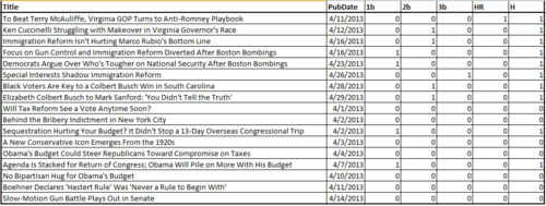
A sample of National Journal content published within April. 1b = Single, 2b= Double, 3b= Triple, HR = Home Run, H = A hit of any type.
Step 4: Determine Your Unit of Analysis
You can compute ratio metrics using any column you have metadata for. In the case of Parse.ly Dash’s snapshot file, we get several pieces of meta: author, post date, headline, site section. For the purpose of this analysis, we’ll look at keywords in headlines. If your Dash implementation includes tags, this analysis will be especially beneficial.
Using a frequency distribution (again, this is a quick pit-stop into some pretty easy Excel formulae), we can determine which words pop up most often in headlines. Obviously we don’t care about “and” or “the” but instead care about the meaningful contextual words. In the case of National Journal, that might be “Obama,” “Republican,” “GOP,” “NSA,” “Immigration,” and so on. Depending on what type of content your site writes—as well as the news cycle—you’ll likely see differing frequencies of keywords month over month.
In any event, we flag each piece of content—which is already categorized as a single/double/triple/home run—as containing one or more keywords.
We then (again, an Excel trick) aggregate all iterations of a keyword by headline and see how many uses each keyword gets, and how many hits—and of what type—that keyword receives.
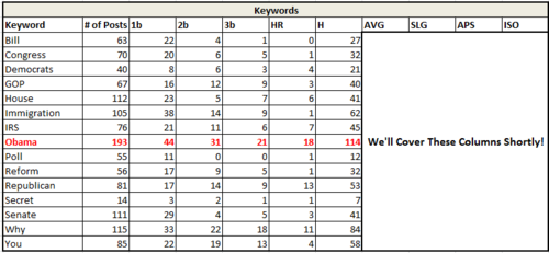
For example, in the chart below, we can see that the word Obama was used 193 times, and that of these 193 times, 44 were singles, 31 were doubles, 21 triples, and 18 home runs. In total, then, there were 114 successful “hits” in 193 attempts.
Step 5: Apply Your Ratio Metrics
We now have everything we need to compute our ratio metrics. We’ll discuss each one as we build our table.
Batting Average (H/# of Posts) simply looks at the number of successful stories (regardless of magnitude of success; a story that gets the minimum amount of traffic required for success counts just as much as the story that goes viral and gets millions of views) out of the number of total stories written. Frequently, we see high batting averages for regular columnists who have a loyal following. That following may not be especially large, so any individual story written by the columnist will not be in the upper 20% of all content, but it will certainly hold its own.
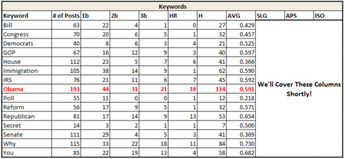
In this example, we can see that stories with “Obama” in their titles do slightly better than the median content. Stories about polls may well be interesting, but viewer are apparently not drawn to the word “poll” in headlines.
Slugging Percentage ((4HR)+(33b)+(2*2b)+(1b))/(# of Posts) is the complement to batting average. Instead of weighing each type of hit equally, it counts them according to where they fell on your success spectrum. Singles only count as 1 hit, doubles are weighted 2x, triples 3x, and home runs 4x.
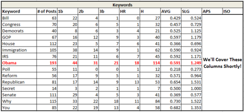
In the chart above, we start to see significant differences between two words that are synonyms. “GOP” and “Republican” both have good batting averages, but headlines using “Republican” instead of “GOP” are much better able to go well beyond our minimal success thresholds. Assuming we’ve got the space in a headline, then, we should be using “Republican” instead of “GOP”. Same meaning, different traffic outcomes.
Internally, we’ve seen that stories reliant on single charts or graphs have very high slugging percentages—but not necessarily high averages. Typically, the stories that “hit for extra bases” pick up a lot of social sharing. Charts and graphs can be sharable, but not every such story gets so lucky with sharing.
Average Plus Slugging (AVG+SLG), or APS, simply sums the previous two metrics. This allows for identification of content that not only frequently succeeds, but gets enormous amount of traffic when it does so. In baseball, the top 10 hitters all time by this metric are ones that even the non-baseball fan would recognize: Babe Ruth, Ted Williams, Lou Gehrig, Barry Bonds, etc. Content with a high APS is very likely to go viral when it succeeds, and succeeds frequently.
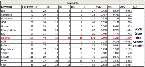
In this example, we begin to really see the potential of using headline keywords that are not necessarily rooted to the news cycle. Look at the last 2 lines of this table, where “Why” and “You” succeed approximately 70% of the time and with very high slugging. Any time we can write a headline along the lines of “Why You Should Care About ____________” it’s got a pretty good chance to succeed to a great degree. (and if it’s something like “Why You Should Care About What Republicans Are Doing About ______,” even better.)
Isolated Power (Slugging % – Batting Average) has the effect of only counting non-singles as hits. The charts and graphs example above have high isolated power—they may not always succeed, but when they do succeed, they tend to be doubles or better. A columnist, on the other hand, may hit nothing but singles—a high average hitter, but one who is rather unlikely to have any story go viral. This allows for identification of content that’s likely—or unlikely—to get picked up by numerous sites and become a traffic home run.
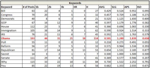
Looking at isolated power, we see that “Bill” and “Congress” despite performing roughly close to the median in terms of frequency of success, have very little chance to turn into large successes. “Bill” especially is weak, with an enormous number of its successes being mere singles. Note: This is a good example of needing to contextualize the keywords you’re looking at. In this instance, I’d loop back into the raw data to make sure that “Bill” isn’t aggregating stories about “things that may or may not become laws” and “Bill Clinton.”
Frequently, as in the “bill” example, there’s some context necessary in the analysis. While Parse.ly Dash allows us to pick out individual keywords from story titles and thus consider the entire selection of published content, we still need to be careful.
“Boston,” for example, is not inherently interesting (no offense to those of you from Boston), but punched well above its weight this spring due to stories about the Marathon bombing. That’s not a repeatable lesson—one cannot predict tragedy, and hoping for them to drive traffic is obviously rather morbid. Similarly, were “race” to surface as an important keyword on National Journal, we would need larger context: is this talking about a congressional race, or is the word being used in the context of changing racial demographics of the electorate?
– Adam Felder, Associate Director of Digital Analytics, Atlantic Media
Interested in trying out these kinds of insights for your publishing site? Download the Cheat Sheet for Digital Media Analysts and get in touch with us to find out how your team can use Parse.ly.