The Parse.ly brand refresh: Our 10 year glow-up

We’ve had a busy September – no sooner did we return from a marathon of conferences, than the team re-launched the Parse.ly website with a spiffy brand refresh and a new and improved Content Library.
Our blog is next on the list for a facelift so next time you visit, you may see our content in a new context. The Content Library is a cool addition – we want to enable you to draw on all the helpful content we’ve produced from network-wide research and customer case studies, to best-practice guides and experiments from our Parse.ly University Partners. Plus, did you know we produce a newsletter every other week? Or that you can access our full network of data in Currents? Our team aims to continue offering information-packed, actionable insights that are informed by data on our network to help you get more from your content. (By the way, we’re hiring!)
So we decided to rewind a decade to 2009 and offer a glimpse of where we came from – and where we are now.
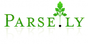
Back in 2009, here’s how Parse.ly’s original 2009 logo looked:
Here’s some fun startup lore about how we “acquired” this logo. I wrote about this in a post entitled, “Parse.ly: brand hacking”:
Our first Parse.ly logo was designed as a trade for another domain I happened to own. It was the dormant domain for a film project for one of my friends, Josh Bernhard. I had registered it for him while we were both in college. […] It so happened that my friend had picked the name “Max Spector” for his film, and thus registered maxspector.com. The film never came to fruition, so the domain just gathered dust for awhile. But, Max Spector happened to be the name of a prominent San Francisco designer. And Max got in touch with me about buying the domain for his personal website. Acting opportunistically, I offered it in trade for a logo for Parse.ly. To my surprise, he agreed.
I still have a fondness for that logo though now that it’s a decade old, it obviously has a dated “web 2.0 startup” look.
A stroll down Memory Lane…
Every era of tech startups has design trends that influence it.
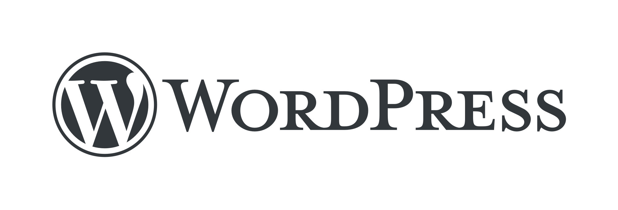
In 2009, our typeface was influenced by the logos of WordPress and Twitter. That kind of makes sense, given how big they were in tech/media community at the time. The WordPress logo still uses a smallcaps and serifs-heavy typeface:
The heavy gradients, shadows, and emboss effects reflected in the green colorings of Parse.ly’s original logo may have come been influenced by Twitter. See, for example, this version of Twitter’s 2009 logo:

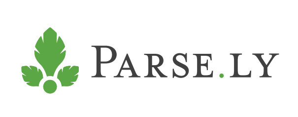
Our simplified revised logo
The first revision to our original logo came in 2012, when we decided to simplify the logo coinciding with the commercial launch of Parse.ly Analytics. That resulted in transitioning from a complex 7-leaf icon, to a much simpler 3-leaf one. It also had us remove “circa 2009 logo flourishes” like typeface coloring with gradient and shadow.
We preserved the custom typeface that Max, the designer from San Francisco with whom I traded a website for a logo, had created for us, and coupled it with the simpler icon.

We kept a touch of green gradient, but only in the icon itself.
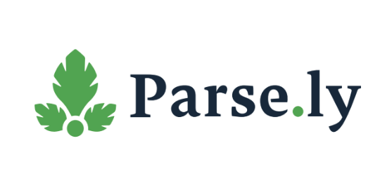
Further refinement
When we hired our head of design, Marguerite Roth, who still works at Parse.ly, we further simplified the logo by removing all gradient effects from the icon, and choosing a friendlier green hue which became part of our standard style and palette.
That version served us well for several more years. I think it also aligned well with the evolving maturity of tech company brands.
Redesigning Parse.ly’s logotype
And now, as Parse.ly celebrates another year of sustainable growth atop customer revenue, we decided to tweak the logo. After all, the world of 2019 is very different than the world of 2009.
In retrospect, the extreme serifs, small caps style, and slightly muted black coloring of our original logotype lacks confidence and affability, despite our brand becoming, over the years, quite confident and affable.
As a result, we’ve decided to give our logo and brand a refresh.
Here it is:
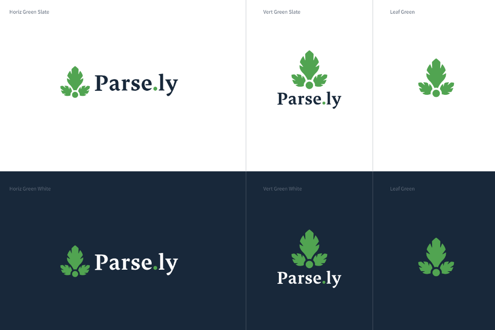
And here is a little style guide snippet to show it in various forms and colors:
What I love about this evolution is that it represents a big change: we have completely thrown away our old logotype. The new type is more open, friendly, and confident. The parts I particularly like include the open “P” and “e”, the tight kerning, and the distinctive dot. The color of the logotype is confident and matches the Parse.ly green well.
The icon looks the same, but it, too, evolved slightly.
Click/watch the video below to see the change between the old and new logo:
See if you can spot the difference.
Evolving the Parse.ly icon
For the icon, the changes were subtle and all about continuous refinement.
Specifically: we made the little “leaf slits” a bit more open, so that the icon appears more textured when scaled down to low resolution (e.g. app icons, site favicons, and so on). We also changed the proportion of the icon slightly to better balance with the new type, and tightened the location of the dot.
Those changes are so subtle, you need to blink to notice them. I’ve helped you out by making this video: click/watch this one to see the subtle change to the leaf icon:
I’m really pleased with these changes and I want to thank Sven Kils, a graphic designer in Frankfurt, Germany, who helped us with the brand refresh.
Like all other things at Parse.ly, our brand is a process of perpetual simplification.
Parse.ly’s evolution and 10-year anniversary
This year was special for me because Parse.ly crossed over several important company milestones. It marks our 10-year company anniversary (how on earth did we make it this long and this far?). We have a new office for our staff in NYC (we’re in Chelsea now, instead of Midtown East); and a more ambitious go-to-market strategy that coincides with the hiring of our Chief Revenue Officer, Nick.
All of these milestones coincide with my own personal return to New York City, which is where Parse.ly began before my relocation to Charlottesville, VA for eight years. I’ve come home to where it all began, and just as it’s starting to get really good.
In addition, we launched a market re-positioning and supporting materials (such as an explainer video) which I’m quite excited about.

Here’s a preview of our new market positioning:
We believe the most successful companies in the digital world are the ones with the best content.
At Parse.ly, we built the world’s most innovative content analytics system, which drove the growth of the web’s biggest sites. We took the expertise and data from that success, and we’ve made it available to every company.
Today, every company is a content company. Every marketer is a content marketer. You need to create and measure content like the pros in order to win an audience.
Imagine you had the audience scale of The Wall Street Journal. Or, the visitor loyalty of the NFL. Or, the branding of Bloomberg. What would that do for your business? These companies used Parse.ly to build a content strategy that creates loyalty, engages visitors, and converts them into revenue.
Leading brands like HelloFresh, TheKnot, PolicyGenius, and Harvard University have also recognized the power of content analytics to transform their marketing efforts, by growing their share of traffic and attention.
We have entered the era of data-informed content. And in this era, the web’s best publishers and brands rely on Parse.ly data to grow a loyal and engaged audience for their content. Join them.
Here’s to the next 10 years of continuous improvement!